2014年4月29日 星期二

La SENZA window design - critical justification

1.       Show Directly
By reduce props and background to a minimum, the product can speak for itself. Using display skills, through fold, pull, stacked, hanging, heap of the commodities to present the product’s form, texture, color, style and so on.

2.       Meaning and imagination
A certain environment, a plot, a certain object, a graphic, or a character’s form and mood can arouse consumer’s associations, to produce some kind of communication with the spiritual resonance to the performance of the various characteristics of the goods.

3.       Exaggeration and humor
Reasonable exaggerated the characteristics of goods; emphasize the beautiful element and substance of things can give a psychological feeling of novelty. Otherwise, humor can achieve both unexpected and reasonable artistic effect.

4.       Use of advertising language
In the window design of lingerie pr clothes shops, using advertising language properly can enhance the theme of the performance. But this kind of window is different from the outside advertisement, cannot have too many words like magazines of poster. It can only use very short and simple words to attract people who just pass the window.

2014年4月20日 星期日

La SENZA window design - conceptual design

1.       Show Directly
Show the products directly which La SENZA is doing now. But La SENZA now does not fully use their window; some of windows have just a very simple poster that make people feel it is going to close down. The first step is filling their entire window with the products.


2.       Meaning and imagination
Combine with a context. For example, summer is coming; the windows can be designed as a beach or with the images of big sun, correspond to La SENZA’s colourful lingerie. Make the window have a theme. “Theme” is what La SENZA need now; its window design has no theme at the moment that cannot attract people to arouse consumer’s associations. For reducing the cost, it does not need a lot of decorations; it can just use some very simple props or images to achieve the goal.

3.       Exaggeration and humor
Once decide which theme is going to be used, it should be exaggerated and added some humor factors. La SENZA’s lingerie is very colourful that give the feeling of lively and vibrant. This factor can be exaggerated in window design. Such as put a series of lingerie with different colour in front of the picture of water, build a image of colourful Underwater World.

4.       Use of advertising language
La SENZA now uses some posters with very simple words like “SALE”, “15”, “UP TO HALF PRICE” and so on. These might attract people that this shop is now in discount, however, the posters are too simple and without any design could also make people feel it has discount is because it is going to close down.

2014年4月6日 星期日

Window design (Part 2)


The year before last year, one of department store in Oxford Street in London, built a series of beautiful window base on fairy tales. It use plenty of decoration and sumptuous or accessorize to decorate the windows. In these series of window, most of the items were not the product what they were selling, the real product usually just have a little space in the window.


However, the fairy tales series window only on the side of Oxford Street, when you turn on the corner to the other small street, there was no big fairy tales window, but some beautiful window focused on showing their product.


They used this way to attract people who walk on Oxford Street to enjoy the art of window design, not for showing product, just for attract people. But when people turn in the corner, they have not been met visual enjoyment.

So the retailer kept showing the beautiful window to satisfy people’s visual enjoyment but promoted the products at the same time. By this way, people would be attracted to get the product’s information without notice.

2014年3月30日 星期日

Window design (Part 1)

Window for a retail shop is very important. Window design gives the first impression to the people. Mostly, people look a shop’s window in the beginning to know if the style of the shop is what they like. Sometime people decide if they want to go inside the shop or shopping desire by only looking their window. So, window design is not just shows their product, but promotes the brand and a pathway of communication between retailer and customer.


Several years ago, one of the shops of “Opening Ceremony” in London changed the posture of the model in window, which made people feel more rhythmic. They did not use a lot of decoration to decorate the window, just changed model’s posture to attract costumer. 


Secondly, the design of window need to be seen through that costumer can see some of other products from outside. Opening Ceremony did it, just used simple models to attract people’s vision and left some space that people can see the shop inside through the glass.

2014年3月21日 星期五

Shopping in Manchester

This is my first time to Manchester, although I have been to Warrington, Chester and Liverpool the city near Manchester more than one time, but I had never thought about going there before. I’ve heard that it is a big industrial city and quite boring. However, I suppose Manchester is a city good for doing the project of Design for Retail.

You can find almost every brand in Manchester. The city centre’s area is so big, and there’s a shopping centre called Arndale. The brand which I want to do – La SENZA has a shop in Arndale as well.

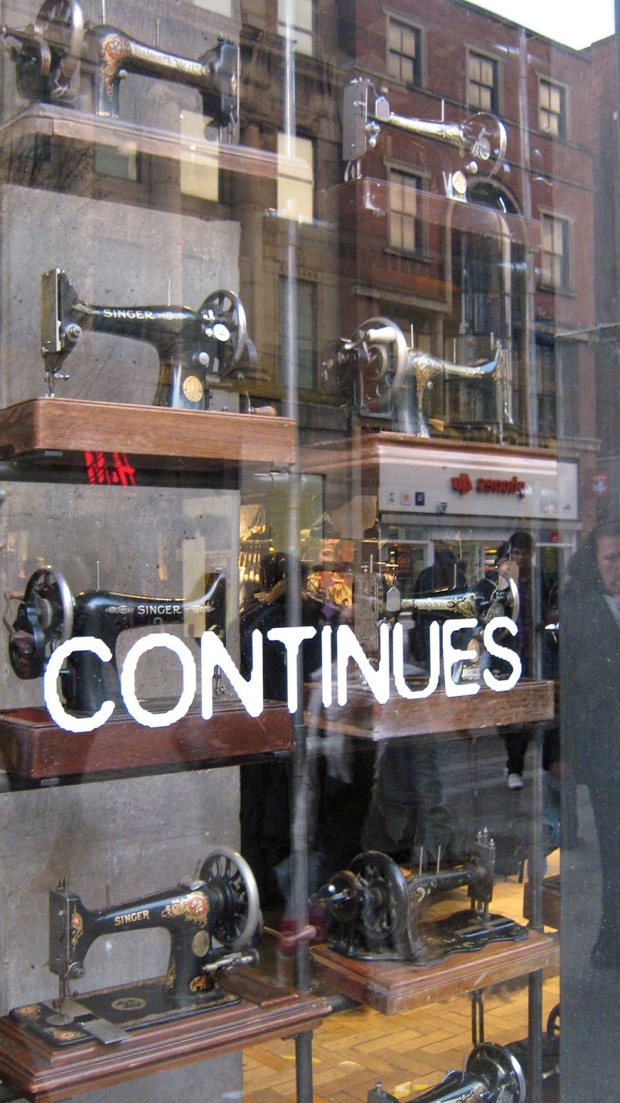
Firstly, when I just got into Arndale, a wall full of old sewing machine can be seen in the beginning. That is a window of Urban Outfitters. I have no idea why they used old sewing machine to decorate the window, but it does achieve the effect of attractive eye.


Outside the Arndale, a clothes shop which is my favourite brand – Jack Wills, is in a little street. Every Jack wills shop has the same interior design: pink and navy blue stripe wall with lots of old fashion pictures in the stairwell, show the style directly.


Then turn into La SENZA. I though the shop in Manchester might be designed better, but actually it’s quite similar: same interior design with lots of wood and empty window only with some posters and model. It has the similar location as the one in Leicester; it’s also in a corner, but just waste the window space to promote their products.


2014年3月16日 星期日

WATCH. THIS. SPACE.

For the little presentation in class, my teammates and I went to the area near St. Marin square; there are two main streets, which are Silver Street and Cank street. Our area also included St Martin square and Silver Arcade.

In this area, there are totally 105 shops, 47 for service, 38 for retail and 20 closed.


We chose another day for choosing which shop we would like to introduce. The shop which I chose was an accessorize retail shop, named WATCH. THIS. SPACE. This shop is a cutting edge design boutique that showcases and sells the work of independent designer/makers and graduates locally and from across the UK. In here, you can find very good price for a cutting edge design and the products which are sell in here are either limited edition or bespoke.

They used plenty of feather, woods, books and basket to decorate the shop, make people have the feeling of Revival, Indiana or Bohemian-style. It’s quite unique and has their own style. That’s the reason why I chose this shop to introduce.


But because of their unique, when I asked the staff if I can take photographs for my presentation, she said they are not allowed any photograph, and just said I can use the pictures they share on Facebook. Others shop like what Kelly and Justin chose, they we just asked them if we can take pictures and the reason why we need, they said yes generously.

2014年3月2日 星期日

La SENZA (Part 2)

According to the interview of staff in La SENZA, I know that the peak hour of the shop in Leicester is from 12pm to 3pm, and the most popular day is Tuesday, then Wednesday evening, after that is Friday. Saturday has 1% different less than Friday. That is quite a big difference between the realistic and my imagination. I thought Saturday and Sunday should be peak period; however, the realistic is totally different. The staff even didn’t mentioned Sunday.

In general, there are 670~700 people go inside this shop per day, but only 15% of costumers really buy something. Most of people go with their friends or family seldom see people go along.

Because I want to redesign their window, I searched some pictures about other La SENZA shop on other city. I thought only the one in Leicester didn’t pay attention on the window design, while most of images of La SENZA’s window were not really design well. Most of them also just put some models wearing their products or only poster. Seldom shop put attention on the window design.


2014年2月23日 星期日

La SENZA

I have chosen La SENZA as the shop to re-design.

La SENZA is a lingerie shop which is in a corner of High Cross. According to my observation for three weeks, they change their window every week. However, they have a big space for window; they do not use it well. They just put a model in some of the window and change their lingerie every week; some of windows even just have a poster of their sale information. It does not have good design.


The other problem in this shop is their fitting room. They use fabric to cover the entrance for each room, but the big problem is the fabric cannot cover the whole entrance, it have a big gap the people can see from outside. For a lingerie shop, this is a big disadvantage, because girls have to naked inside and try the new product.

But, a good point is they consider about disable people that have one fitting room specific for disable people, although it still have a big gap.


During the time when I was there, about 30 minutes, most of customers were go with their friends, with a group of girl, go with family or with partner, seldom people go along. 

2014年2月16日 星期日

How a shop present their brand - La SENZA

  • How we think high street change in 20 years?
  • A lot of shop combine media in their store that customer can compare the price more quickly. At the same time, the products become unique and individual.


  • La SENZA’s use peachblossom and black as the colour of the brand, staffs’ uniform are black T-shirt with their logo on it and black trousers. However, before you go into the shop, you can see very colourful image. They sale plenty of different colours’ product and most of them are light colour with bright lights, that make people feel full of energy. But they don’t use peachblossom and black for their main colours, just have a black counter. The interior design of La SENZA was used a lot of wood on the wall, which is not very in the link of their brand colour.


  • Move on to the fitting room, they use pink and black as the main colours, and the curve which is similar as their logo.


  • The time when we were observed the shop, the seller actually didn't have too much interactive with costumers; they used most of free time to arrange the products. But if anyone has any problem of request, they were all very kind.